The official McQuaid Jesuit logos are the primary elements of the school’s visual identity. The Director of Communication oversees and approves all usage of school logos. Please contact Casey MacClaren, ’12 at cmacclaren@mcquaid.org for copies of the official logos, permissions, and all other branding requests.
Examples of designs that require approval from of Director of Communications include, but are not limited to:
- Anything being printed for distribution that will include logos or brand materials.
- Clubs, student groups, special events, or other groups planning to use the school’s name, colors, or logo.
- Apparel or merchandise for sale or being given away for free.
- Official presentations, programs, pamphlets, or other informational materials.
- Anything being created with the official logos should be proofed by the Director of Communications.
Approved Logo Variations


















Knight Head – The word “Jesuit” has been replaced with the sport, department, or club, using the same font, color, and curve to match the logo (Sports World.)
Alternate Knight Head – The word “Jesuit” has been moved to the top and the lower word is replaced with the sport, department, or club, using the same font, color, and curve to match the logo (Sports World.)
‘M’ – The sport, department, or club has been added under the “M” in the same color and font (Sports World.) “Jesuit” is also acceptable under the ‘M’.


Only to be used if another approved McQuaid Jesuit logo is present. The office of Mission & Ministry may use these logos without another logo present.










Athletic and club bumper stickers may vary at the discretion of the director of communications.

The strategic plan logo should be used strictly for communications directly related to the plan. This should be included on letterhead used when corresponding with donors in regard to the plan.



Logo Spacing
Consideration must be used when placing logos next to graphics, text, photo elements, or the edge of a frame. You must allow for safe spacing around the logo.


Examples of Incorrect Logo Usage







Brand Colors
These are the main colors and should be the predominant colors used on any creatives.
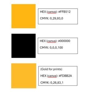
These colors should be used to support and expand upon the primary palette. They are to be used alongside the main palette.

A tint is a mixture of color and white to increase its lightness. While McQuaid’s colors should typically be used at full strength, tints can be used in instances that require a more subtle color variation or require some differentiation. Tints can be used to create hierarchy, separate colors, construct overlays and extend core colors. Tints should never be used independently of the full-strength color palettes. Tints should only be used in support of primary and secondary colors to extend that color for specific applications.





Photography
Photos should:
- Be free of clutter
- Focus on a subject to draw the eye in to the photo
- Feature McQuaid Jesuit gear/clothing/buildings if possible. When in session, students that are pictured must be in dress code or approved dress-down
- Reflect the diversity of the students, faculty, and staff of McQuaid in all respects
- Check for shirts, signs, or backgrounds containing controversial language or images. Ensure no hand signs are displayed.
- Photos taken on a cell phone must be taken in a landscape view (see below)

Accurately fill out the following to the best of your ability for each photo before submission to the director of communications. This should include the following information:
- Names and titles of those pictured, (left to right)
- Date captured
- Caption information describing what is seen in the image
- Location photo was taken
Photo credits should read:
(Photographer’s Name / McQuaid Jesuit)
Submitted photos should read:
(Photo Courtesy of John Doe)
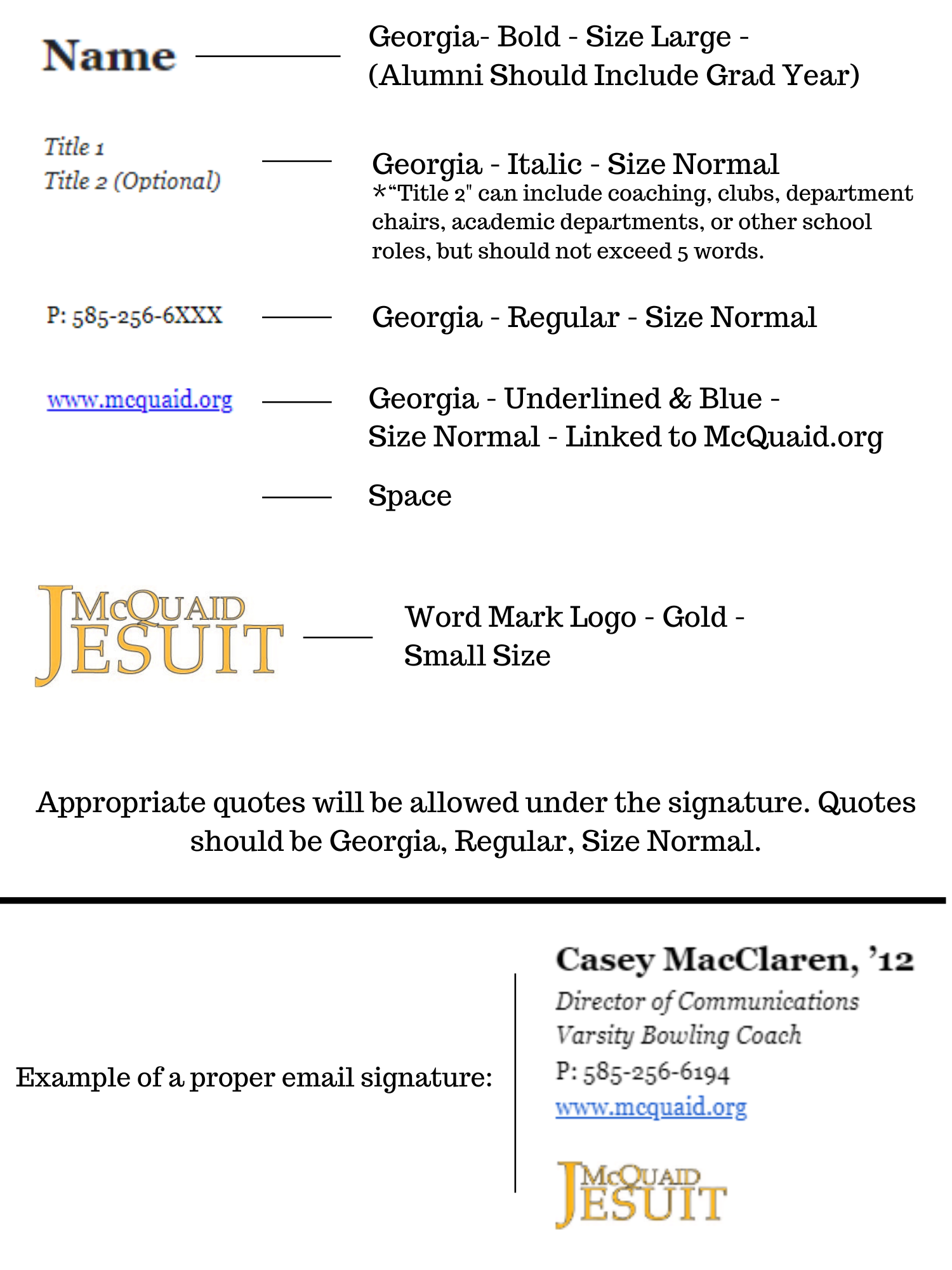
Email Signatures
For help changing your email signature, please contact help@mcquaid.org.